image credit: Buzzfeed
The multiple voices trying to send messages when opening the front page of BuzzFeed bombards you with ads, big popups, and a messy-looking homepage. This homepage is a massive downfall for people trying to get news or up to date on the new media. Most consumers would want a stress-free and eye-appealing homepage to grab interest and inform them of the more significant news stories.
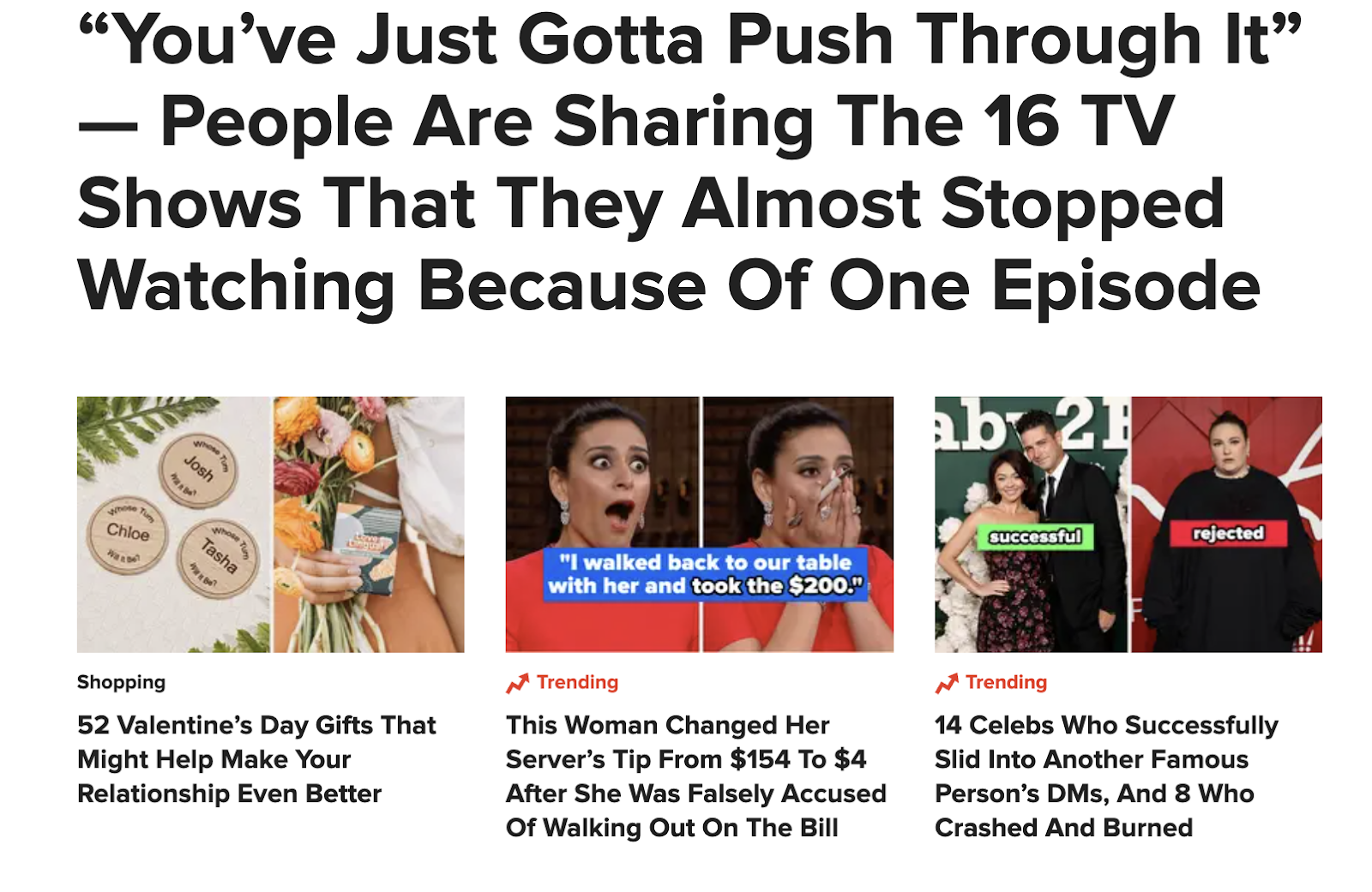
The tone of this media site gives off a forward approach to grabbing the attention of the audience by having news ad pop-ups all over your screen, trying to get you to click the external link to that story. Their tone is pushy and fast-paced, and there are a lot of attention-grabbing titles and clickbait for the average consumer.
One main feature I found very hard to work around as a consumer was the number of ads that would cover the news stories that you are reading, trying to get you to go off and do something completely different; this will lead to it being an annoyance to most consumers. Some of the promoted uses are being very inclusive with how much information they provide so every consumer can find something interesting to them.
Most of the images and graphics I saw on BuzzFeed were distracting and out of place, and very hard to depict the tone and rhythm of the text. As someone who uses visual rhythm when I read to help comprehend the information in learning, it's very important that the images used depict the text very well and are placed strategically so it's organized and utilized in the best way possible.
Buzzfeed has many options to read from and many popup articles that are supposed to grab one's attention or redirect you deeper into the information. They are good at capturing attention, but there needs to be a new approach to having a good layout. As we learned in the textbook, Buzzfeed needs a better Z path to keep consumers returning for the following article, not focusing on getting as much information out on the screen as possible, making it harder to focus on one thing at a time.
Each article is separate, and they have multiple writers publishing work. That being said, with how many stories they put out, they keep a good range of topics for everyone, so they have something that will interest most people. This is a big part of news websites because it allows them to broaden their consumer base and continue to gain popularity.
There is not any graph based support used in this website, however there are a few navigational links and references present. Buzzfeed is in large support of the navigational link. They are struggling to stay relevant in the news industry and therefore use every single one of their articles to promote other articles that they feel lack in views. This takes away the attention of the reader, and is often overlooked unless one has questions within the article. This makes the overall professionalism of this website seem more average and less valid. This website lacks the metaphorical elements as well. These three elements of a website are important for validity, however the use of these three elements prove that it has no credibility in journalism.
The tone stays consistent with each article. Though BuzzFeed is a media outlet it has all different kinds of articles you can read from. This makes the rhythm a bit different from a traditional newspaper article or news website. Buzzfeed has a fast-paced pace, up to date on drama, news, politics, and random fun facts for everyone to find something they can benefit from. The tone of Buzzfeed is a little pushy and can seem very outlandish with some of the clickbait titles and misleading use of images making the navigation aspect of this website a little more puzzle-like.
Buzzfeed has information on such a broad variety that it can cater to most individuals. Although there are fixes to be made to make it more consumer-based they have a really good thing going for them and have a recurring audience showing back up day to day
Comments
Post a Comment